box
Create a boxed group, that could have a title.
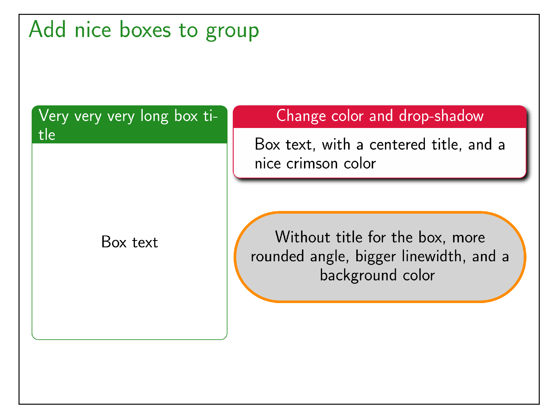
from beampy import *

# Remove quiet=True to get Beampy render outputs
doc = document(quiet=True)


with slide('Add nice boxes to group'):

    with box(x=20, y='center', width=300, height='60%', title='Very very very long box title') as b1:
        text('Box text')

    with box(x=b1.right+10, y=b1.top+0, width=450,
             title='Change color and drop-shadow', title_align='center',
             color='crimson', shadow=True) as b2:

        text('Box text, with a centered title, and a nice crimson color', width='90%')

    with box(x=b1.right+10, y=b2.bottom+50, width=b2.width, color='darkorange',
             rounded=70, background_color='lightgray', linewidth=4, auto_height_margin=30) as b3:

        text('''
            Without title for the box, more rounded angle, bigger
            linewidth, and a background color
            ''', align='center', width='90%')


display_matplotlib(gcs())
Module arguments
-
class
beampy.box(title=None, x=’center’, y=’auto’, width=None, height=None, parentid=None, **kwargs) Draw a box around a group.
Parameters: - title (str or None, optional) – The title of the box (the default value is None, which implies no title).
- x (int or float or {'center', 'auto'} or str, optional) – Horizontal position for the group (the default is ‘center’). See positioning system of Beampy.
- y (int or float or {'center', 'auto'} or str, optional) – Vertical position for the group (the default is ‘auto’). See positioning system of Beampy.
- width (int or float or None, optional) – Width of the group (the default is None, which implies that the width is computed to fit the group contents width).
- height (int or float or None, optional) – Height of the group (the default is None). When height is None the height is computed to fit the group contents height.
- perentid (str or None, optional) – Beampy id of the parent group (the default is None). This parentid is given automatically by Beampy render.
- rounded (int, optional) – The number of pixel for rounded borders (the default value is 10).
- linewidth (int, optional) – The linewidth of the border in pt (the default value is 1).
- color (svg color name as string, optional) – The color of the contour line of the box (the default value is ‘red’).
- head_height (int or None, optional) – The height in pixel of the background under the title (the default is None, which implies that height is computed from title height + 10px of margins). You need to adjust this value for multi-lines titles.
- shadow (boolean, optional) – Draw a shadow under the box (the default value is False, which means no shadow).
- background_color (svg color name as string, optional) – The color of the background of the box (the default values is ‘white’).
- title_color (svg color name as string, optional) – The color of the title (the default value is ‘white’).
- title_align ({'left','right','center'}, optional) – The horizontal alignment of the title (the default value is ‘left’).
- title_xoffset (int, optional) – The horizontal offset in pixel from the box border of the title (the default value is 10).
- auto_height_margin (int, optional) – The vertical margin in pixel (top and bottom) to use when box height is not specified (the default theme sets this value to 15).